
Last month, Southern Living shared an article called “4 Paint Colors You Should Never Use In A Dining Room, According To Designers.”
It features colors to avoid if you want to create a warm and inviting space perfect for entertaining friends or sharing a meal with your family.
One of the designers they asked for input from was yours truly!
Now, you know I don’t disparage any color when it really comes down to it. But when pressed to make a choice, the color I would avoid in a dining room is mint green. Wanna know why? Like most people who draw a hard line against one color or another, I have a trigger. The walls of my elementary school were made of cinder blocks, and in the hallways, that cinder block was painted a glossy mint green. I have not-so-great memories of the low ceilings and fluorescent lights (don’t even get me started on those) down what seemed to be endless corridors of the school, and as a result, I just don’t love that particular hue for trying to create an atmosphere of togetherness and congregation.
I guess what I’m trying to say, which could come as a shock to no one, is don’t try to force it. It’s fine to love some colors more than others, but also be open to the idea that no color is inherently “bad”… I’ve seen gorgeous living rooms, bedrooms, and bathrooms in mint green that feel lush and sumptuous. But there’s just something about trying to have a meal in a room where the walls that look nauseous that doesn’t sit right with me!
Other colors that design experts recommend you skip in your dining room include White, Neons, and Dull Gray. To find out why, read the entire piece in Southern Living here.
Now that we’ve covered the “don’ts” of dining room colors let’s take a look at some “dos!”
Dining Room Color “Do:” Blues
Other than neutrals, blue is the most requested color we hear from clients. Blue is timeless. Men and women can happily live with it. It’s also one of the few colors that’s consistent no matter how light or dark it is. Unlike reds, it doesn’t become a different hue altogether when you lighten or darken it (the way red would become pink or burgundy).
Blues are good at helping you unwind and allow you to feel comfortable expressing what’s going on in your life.
Here are a couple of blue dining rooms from our clients’ homes.
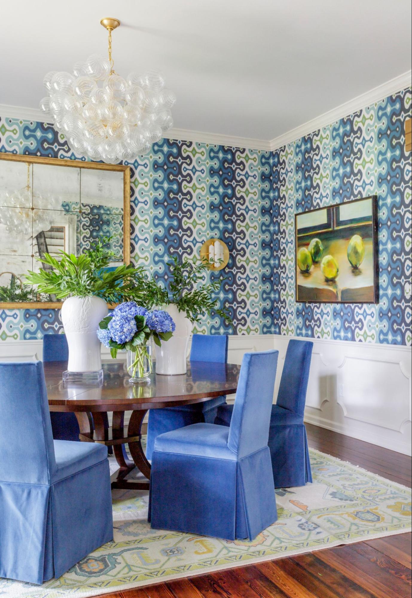
Interior Design & Styling: Rachel Cannon Limited Interiors | Photo: Jessie Preza
Interior Design & Styling: Rachel Cannon Limited Interiors | Photo: Jessie Preza
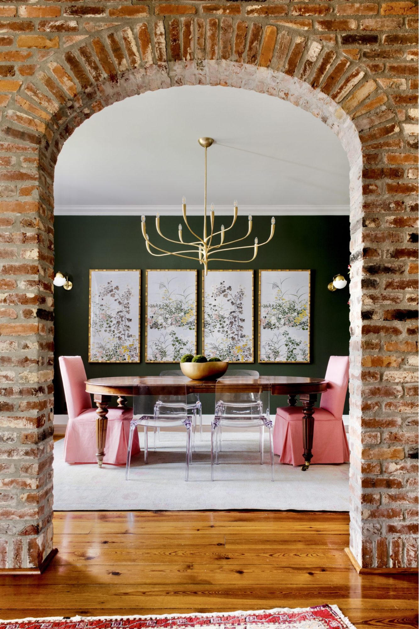
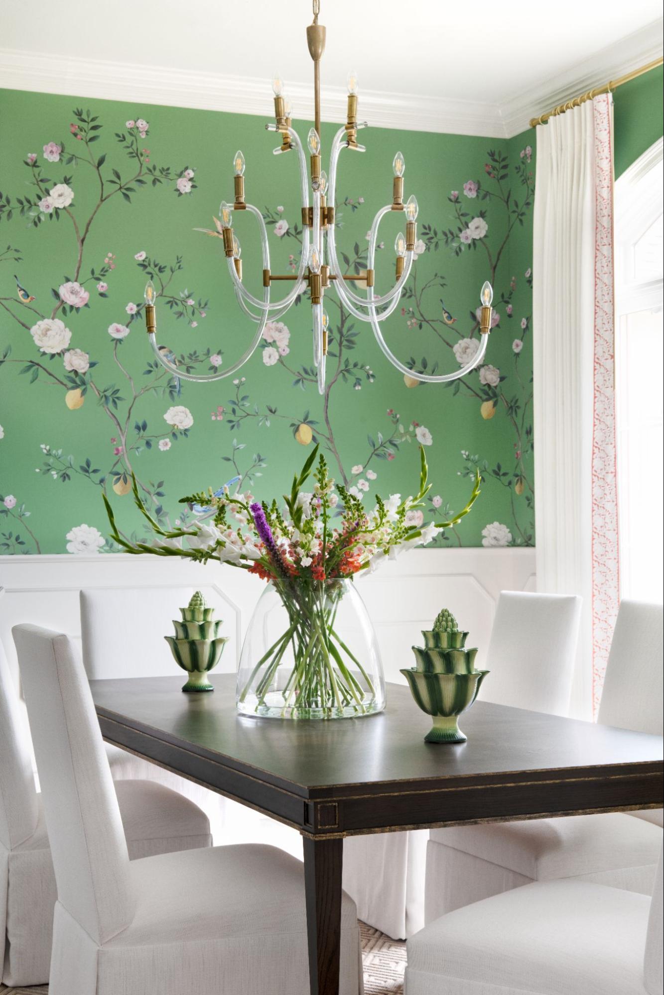
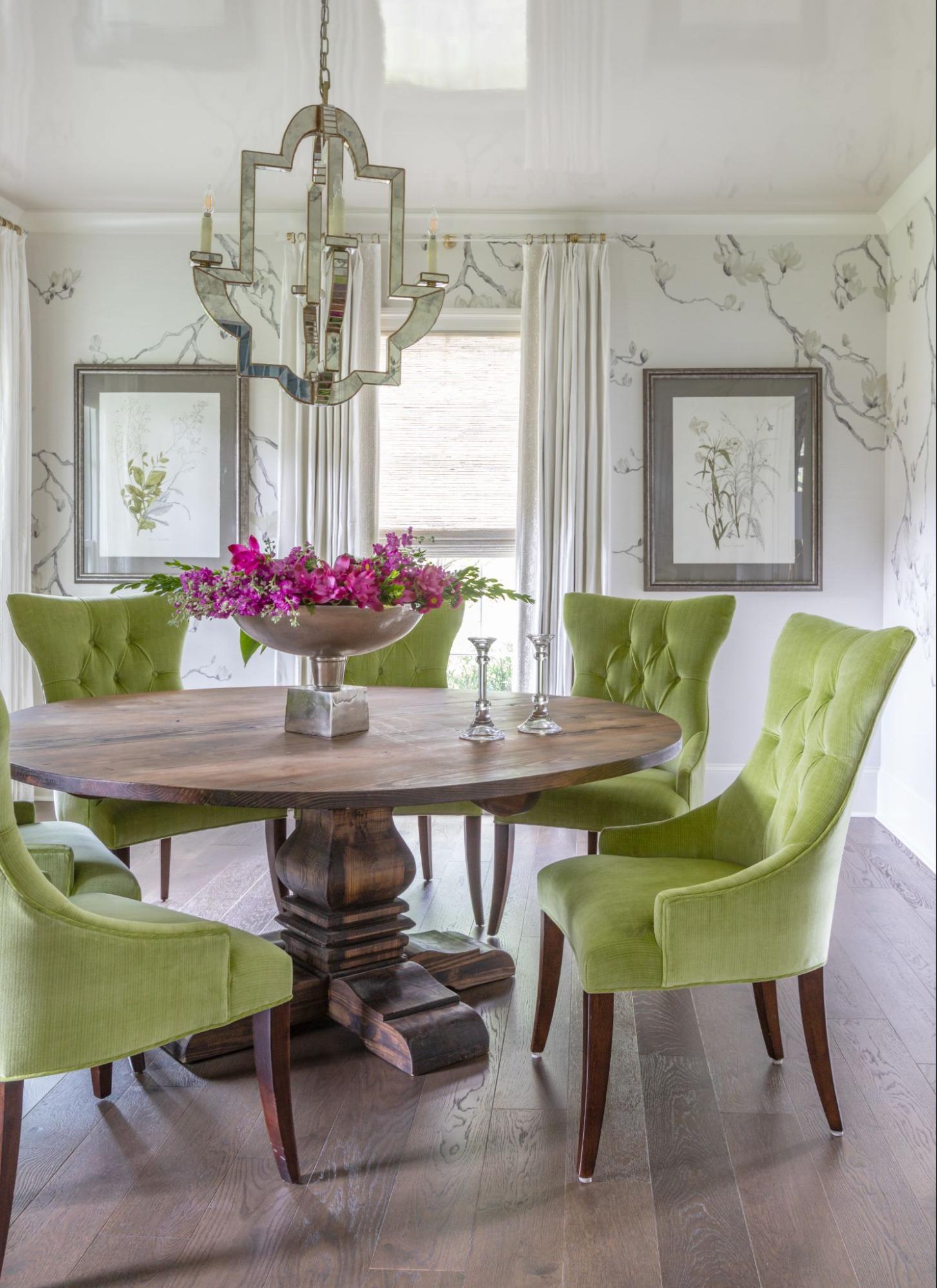
Dining Room Color “Do:” Greens
While I don’t love a minty green for the dining room, there are some greens I can get behind.
For example, the wallpaper in this client’s dining room brings gorgeous life and interest to the space.
Interior Design & Styling: Rachel Cannon Limited Interiors | Photo: Haylei Smith
Another way to use green in your dining room is through green-blues such as aqua and turquoise or in darker hues like the forest greet and teal in this client’s space.
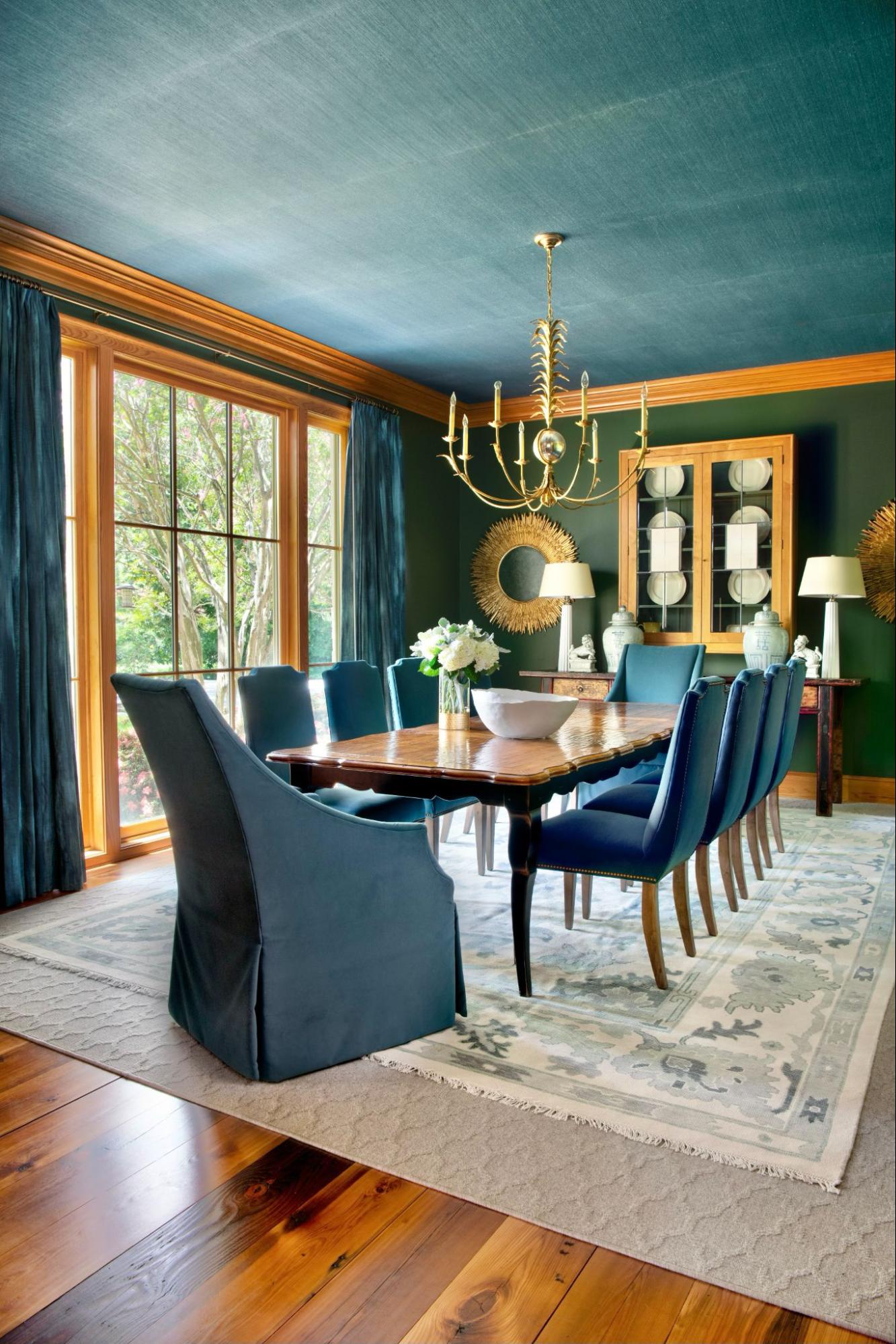
Interior Design & Styling: Rachel Cannon Limited Interiors | Photo: Haylei Smith
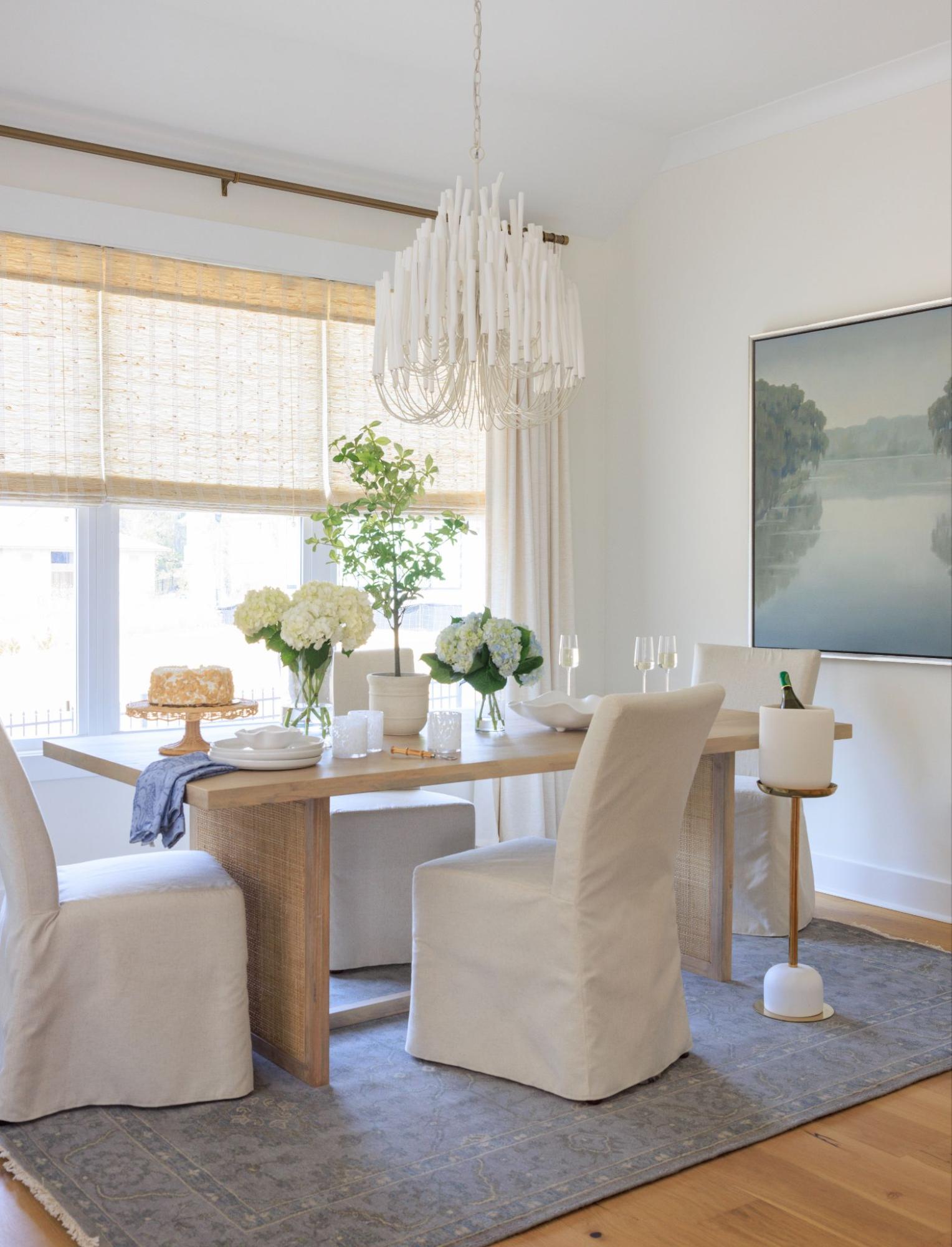
Dining Room Color “Do:” Neutrals
You know I love color, but I also appreciate that the right neutrals can create a clean backdrop for rich, saturated hues in your furniture and other fabrics, such as your window treatments. Neutrals also tend to be easy to live with in the long run.
Here are some of our clients’ dining rooms that feature neutral walls.
Interior Design & Styling: Rachel Cannon Limited Interiors | Photo: Jessie Preza
Interior Design & Styling: Rachel Cannon Limited Interiors | Photo: Jessie Preza
Want to see more of our clients’ rooms and get the scoop on exactly which colors we’ve used, as well as our process for making that selection? Check out our RCL Color Library here!
Ready to make a change but need our help and guidance? Contact us here. We serve clients nationwide!
Leave A Comment